Halo and Halo infinite are owned by Microsoft and 343 Industries. This project is merely a personal analysis on the User Experience and User Interface.
This project is still a WIP
Background
For this case study I wanted to analyze Halo Infinite's UI and UX, particularly with a focus on the multiplayer and free to play aspects, rather than the campaign. Through both playing the game and hearing from other players, there are major issues with the user experience and how content within the game is organized. For this case study I will be highlighting the current issues with the UX and offering some solutions.
Defining the Problem
While the UI art style for Halo Infinite is successful, pain points start to appear in the gameflow in multiple areas. Users have reported difficulty navigating both customization, but also matchmaking flows and grouping up. For a game that is meant to be the platform for Halo for the next 10 years, this leads to some questions about the scalability and viability of this flow for the future.
Player Insight
These quotes from players were taken from comments and posts listed in halo subreddits.
"This feels like every bad idea Microsoft has ever had about UX being implemented into one game. This is awful. I just spent 10 minutes trying to figure out how to tell how much progress I have until the next level of the event pass. Game crashed out before I could figure it out. I quit for the day. Man I thought the MCC UX was bad when it first launched... 100% the most frustrating thing about this game for me is it's unintuitive, confusing, cumbersome, poorly organized, poorly presented, inconsistent UX." - u/SpartanG01
"Its very bad. There is no indication where in this sprawling menu tree you are even at, not that they needed a menu this convoluted to begin with..." - u/EmilMR
"Whilst I agree it should - imo the bigger problem is that the ESC key is inconsistent. It does different things in different menu's, in some menu's it takes you back to the starting menu, in others it brings up that overlay..." -u/FourRightsThenALeft
"...Customizing your character in Halo: Infinite is a massive hassle, make no mistake. I wouldn't even mind the custom color wheel if it didn't take so damn long to get to them for each sub-menu'd piece." -u/Coldspark824
Halo's Userbase
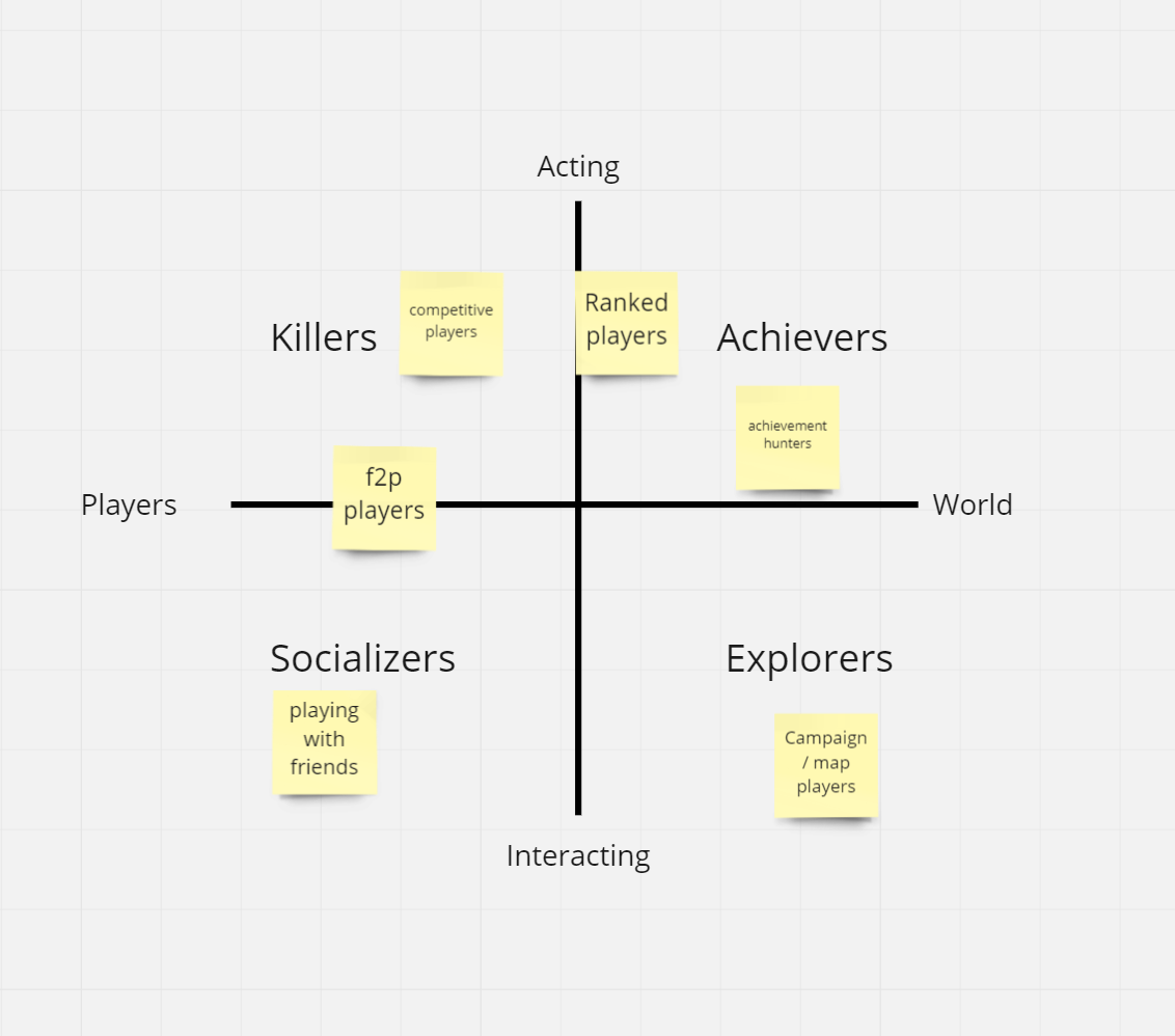
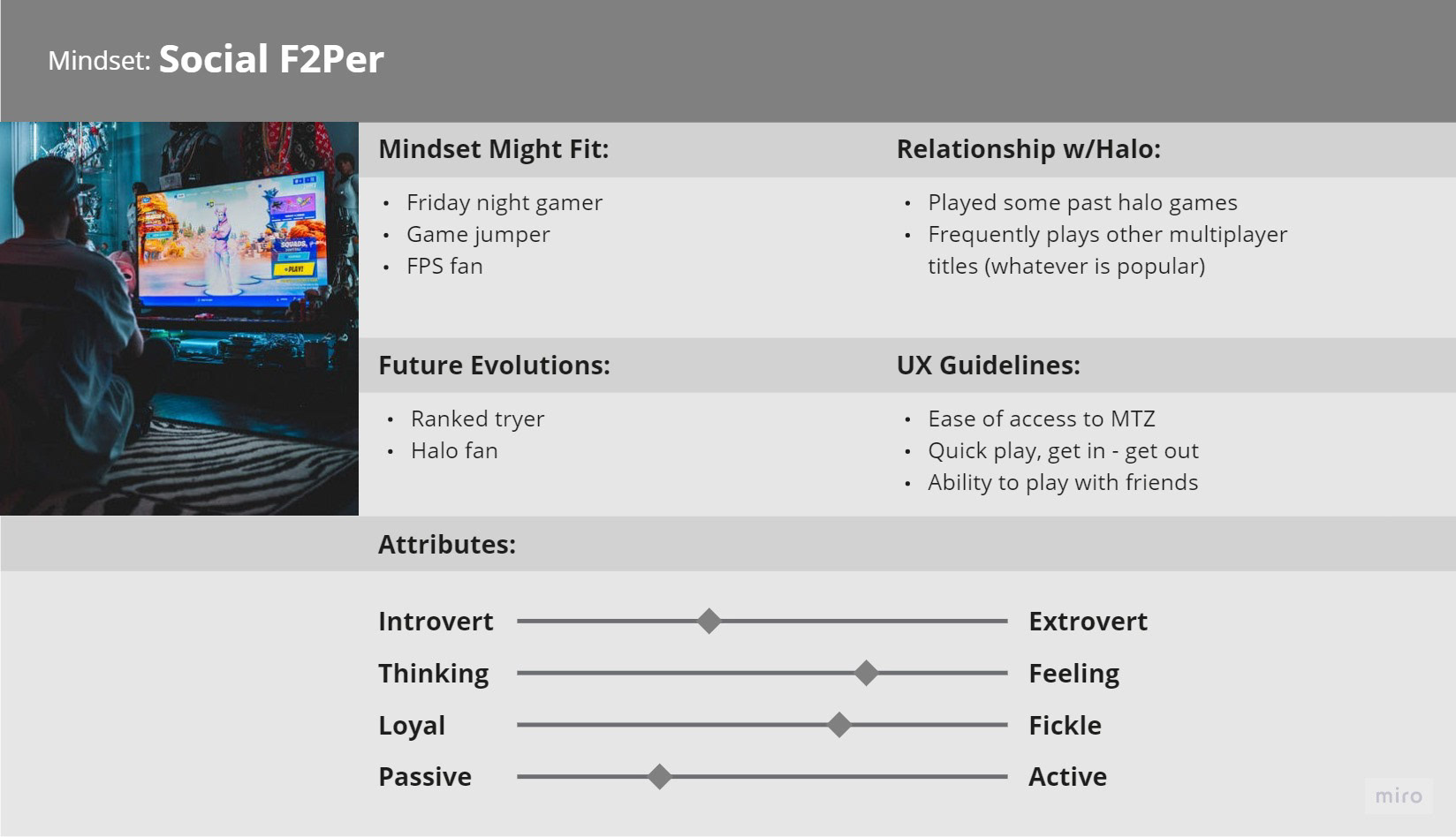
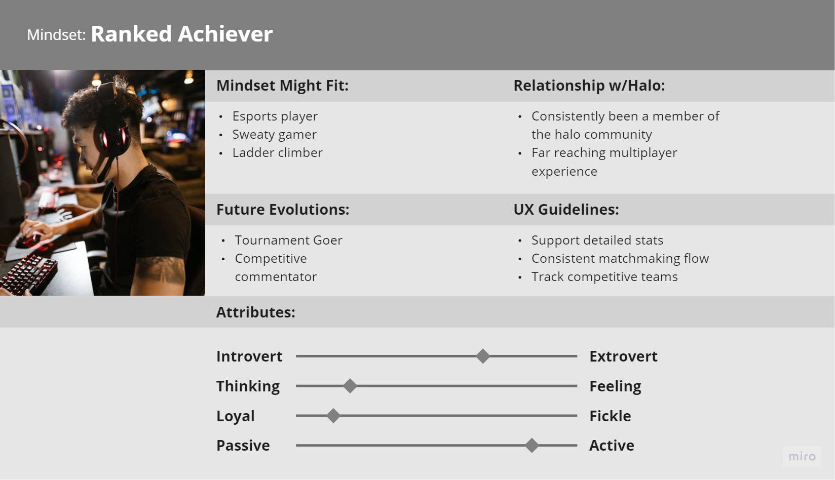
Halo targets a wide audience of players. Having been a long-running series, it is both known for its gameplay and story. You can find players in almost every category of the Bartle taxonomy. For Halo Infinite's f2p multiplayer UX, I believe most of the players would be focused around the mindsets of Socializers and Killers/Achievers. Explorers would be more tuned into the campaign.
Early Ideation
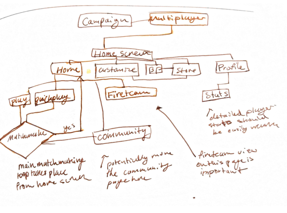
Breaking down the major pain points and UX needs with the current Halo Infinite multiplayer experience.
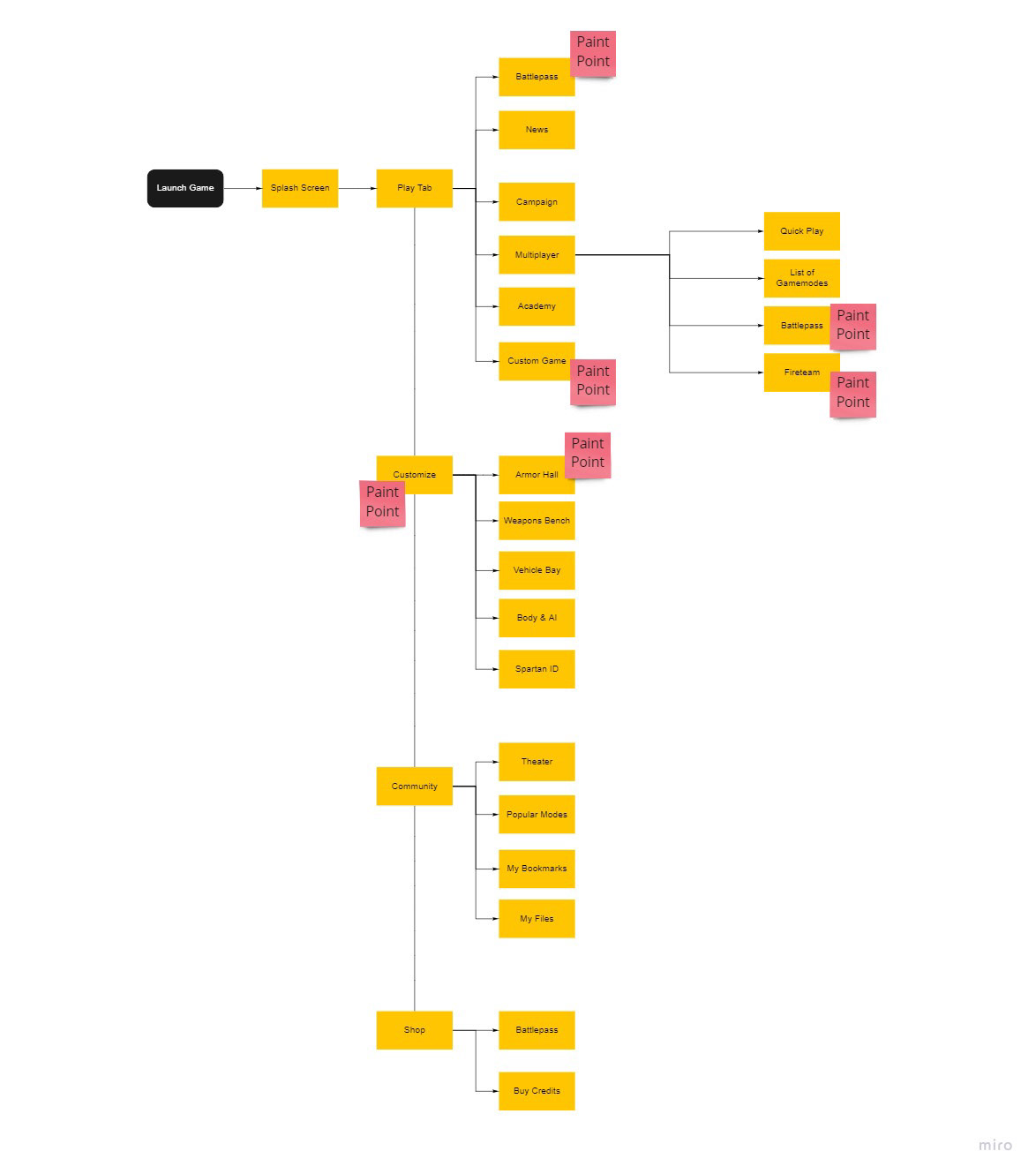
original game flow
updated flow exploration
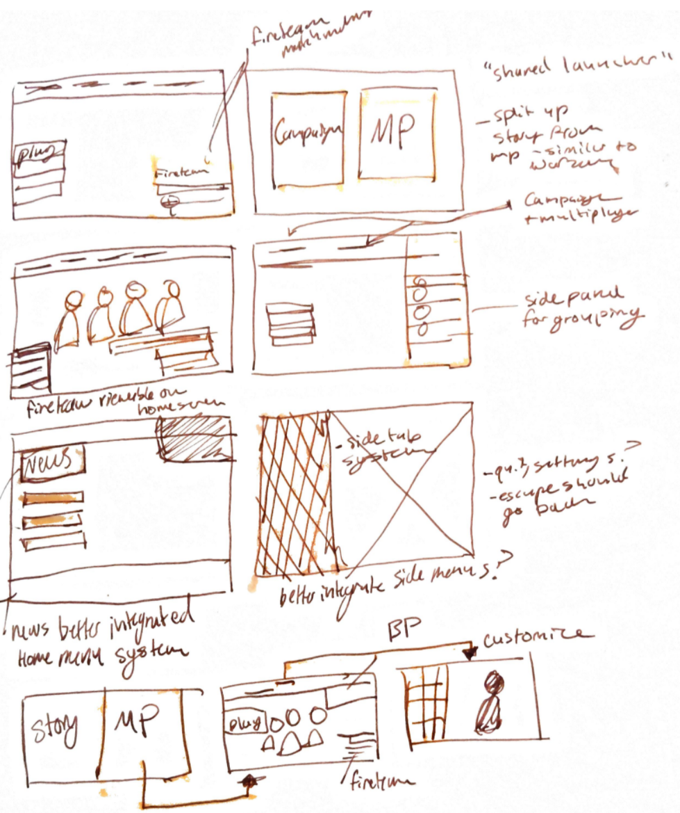
update screen exploration
Pain Points
Inconsistent menu flow
Escape does not go back to the previous screen
Customization menu layers a bit ambiguous
Fireteam and matchmaking info not consistent through all menus
F2P elements mixed with story/campaign mode
Proposed Flow
In this updated flow, the multiplayer experience is front and center to the UX. Story is separated into a separate flow from the main splash screen. The fireteam remains a core and evident element of the UI, and is viewable straight from the home screen. Multiplayer adjacent modes are also better organized, and customization gets some usability improvements.
Task Flow
Wireflow Exploration
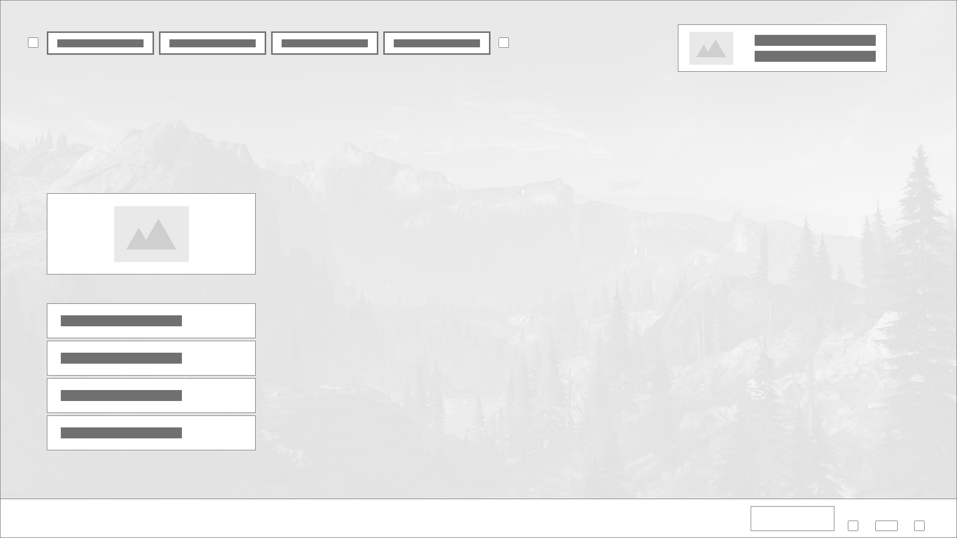
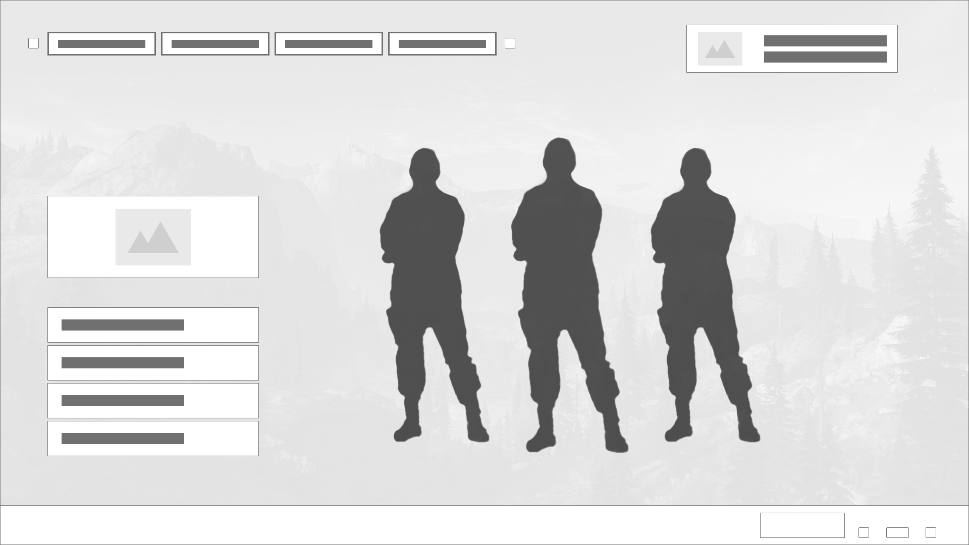
Design Solutions
WIP
Next Steps
WIP
Closing Thoughts
WIP